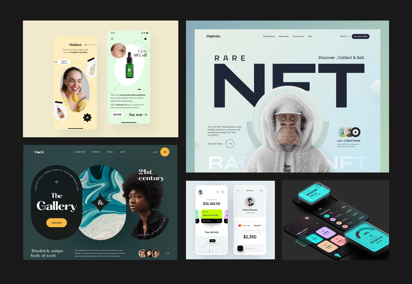
Respect platform conventions and design guidelines. Go through the Apple Human Interface Guideline before you start iOS design and try using components available instead of trying to create your own. All mobile apps released by Apple (iOS )on Android always follow the Android Material Guidelines and not the Apple Human Interface Guidelines and vice versa.
Source: Voot app
App Icons
a. Unique shape: Create a specific shape with alphabets or symbols. Avoid using photo or text.
b. Utility: Portray what the app does. This helps users to connect with your app instantly.
c. Folder legibility: App icon should be clearly visible when its inside a folder.

d. Notification Drawer: Icon should be clearly visible from the Notification Drawer and must be tested on different backgrounds.

Forced Registration
a. There is a high dropout ratio for apps which ask for immediate registration without providing context or information about why its necessary to register on the app.
b. If registering is optional for your app, preferably have a ‘Skip’ option so that the user can get to know more about your app before providing their data.
c. Don’t club login, register and social media icons.
d. Avoid carousels or marketing text in login unless really required.
Source: ToDoist app
Text Readability
a. Color contrast should not be less than 5:1. Any value between 10:1 and 20:1 is great!
b. Smaller the phone, larger the font (11pt minimum font size).
c. Do not use multiple fonts in the app.
d. Avoid using zig-zag patterns when aligning content.
Ambiguous Alerts
a. Avoid unnecessary alerts. Use action sheets or popovers instead of alerts.
b. Place the affirmative buttons on the right. Respect the platform conventions because having actionable buttons on the left is a Windows convention.
Improper Navigation
a. Don’t use the Hamburger menu as the actions are hidden in the first glance and it interferes with the navigation.
As an alternate look at the Tab Bar option provided by iOS with icons for navigation. This makes it easier for the users to navigate through the app and reduces the number of taps when compared to the traditional hamburger menu.
Source: Amazon app
b. Label back buttons appropriately. Show the screen name instead of ‘back’ or ‘cancel’ so that the user knows from which screen they arrived.
Excessive Branding
Don’t have the app name as the navigation title or the page title.
Design Tools
Always test your UI design on an actual device. Below are some tools you can use to test it on an actual device.
Confusing Animations
Use fewer animations and try to preserve the nature of animation when used. For example If you present a screen from bottom to top, it should be dismissed from top to bottom to preserve the natural flow of the animation.


